Our team for this project consisted of myself, Julia Gurevitz, Noah Theodore, and Skylar Booth. We were tasked with evaluating the Nashville Zoo's website from a user experience perspective - noting navigation, content, branding, and additional components - and suggesting adjustments to the site to maximize the user experience.
Individual Assessment
We began by performing individual assessments on the site, its organization, and its content. This was accomplished through a VADU scorecard and Brand Action Review scorecard analysis.
Through the VADU scorecard analysis, we came to the conclusion that the website was lacking in overall usability, as it was sometimes difficult to engage with, but that it was over-delivering on value. The site was presenting the user with so much functionality and information, much of which the user did not actually need, to the point that it was overwhelming the user, distracting them from accomplishing their task, and inhibiting their interactions with the website.
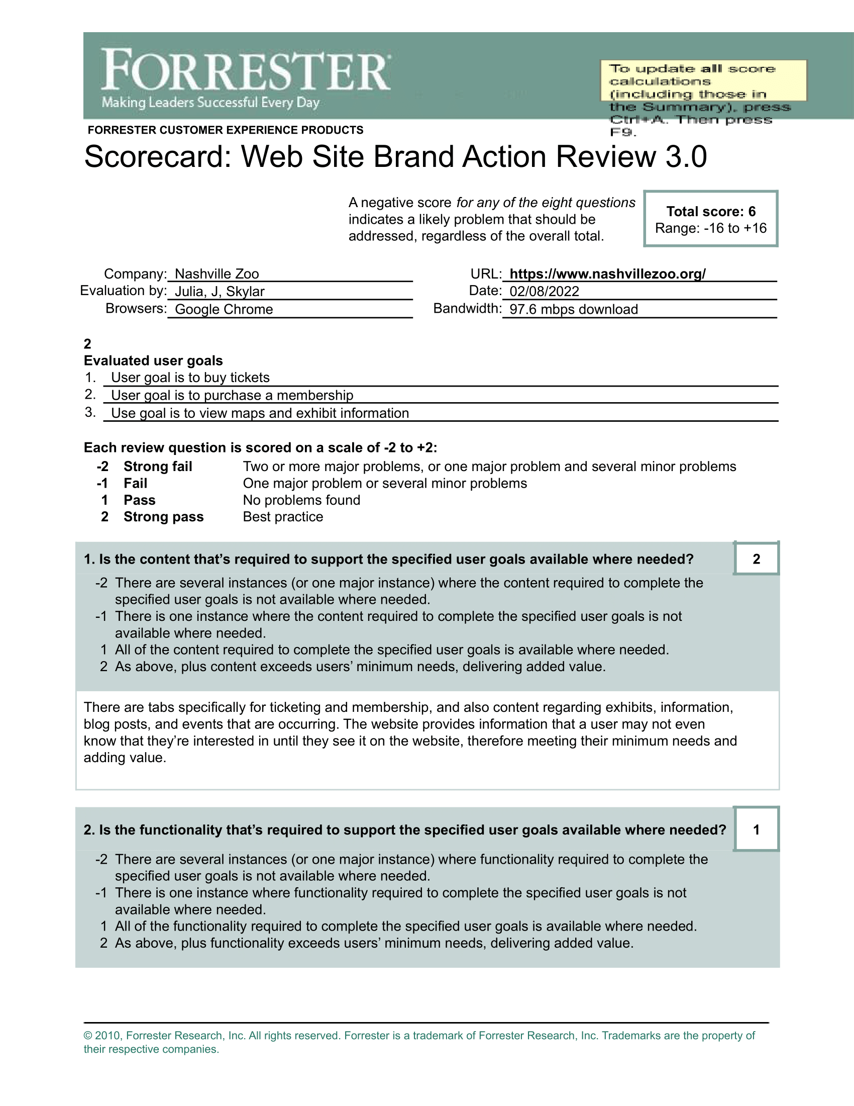
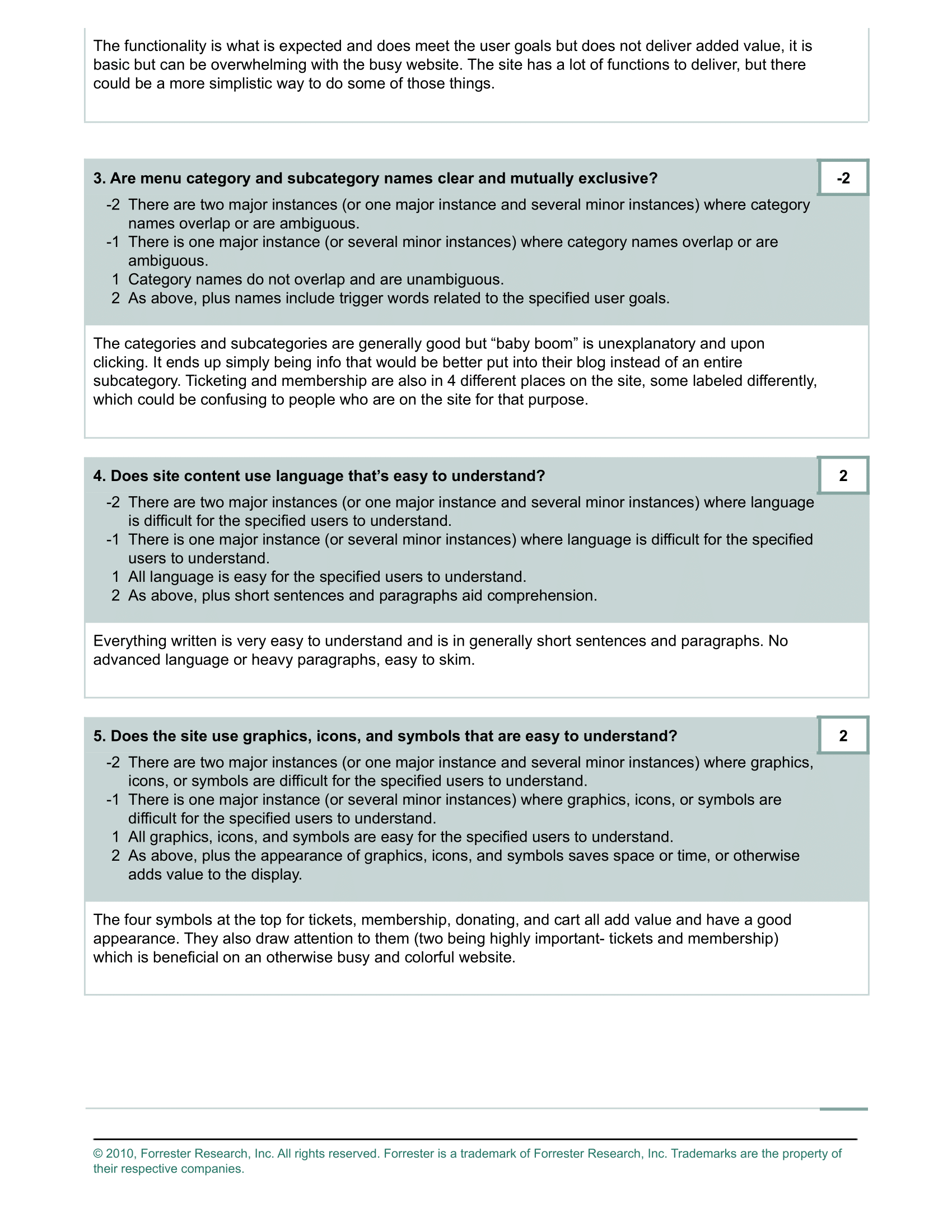
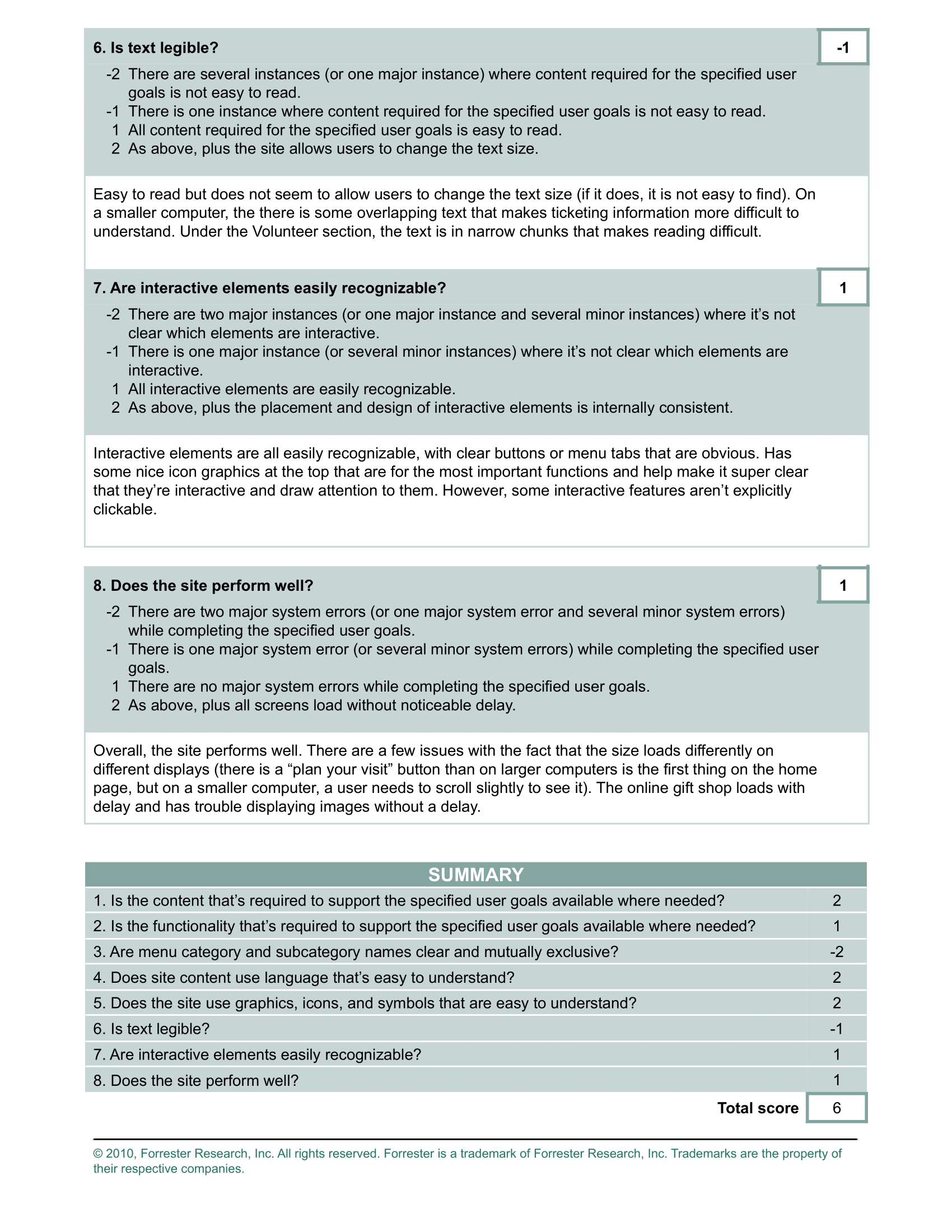
Through the Brand Action Review scorecard we identified another key issue which hindered usability. The menu navigation of the Nashville Zoo's website was very confusing. There were two drop down tabs labeled Visit and Experiences, and it was difficult to differentiate what information may be under which. There were many different links which brought the user to the ticket purchasing page, all labeled differently. There were two links, both labeled "Tickets," which brought the user to different pages. It was very difficult to understand the website's navigation, which further hindered usability. We performed these tests to get a baseline understanding of standout issues with the website which could be expanded upon through further research. Reorganization of navigation would be a major component of our site restructuring as the project continued.
Interviews
Next, we conducted interviews on parents who have organized trips to the zoo recently, although we had to expand our definition of recently to include several years ago, as many people have likely not been to zoos due to the global pandemic. Parents were selected because they were often planning a trip for themselves, children, and possibly even friends. This additional context was beneficial, as it gave us a deeper understanding of why users made certain decisions and interacted with resources in certain ways. We compiled notable information from these interviews on a whiteboard and, after many iterations, separated them into various categories. Then, we individually drew dots next to the three categories which, based on our interviews, we believed to be the most important.
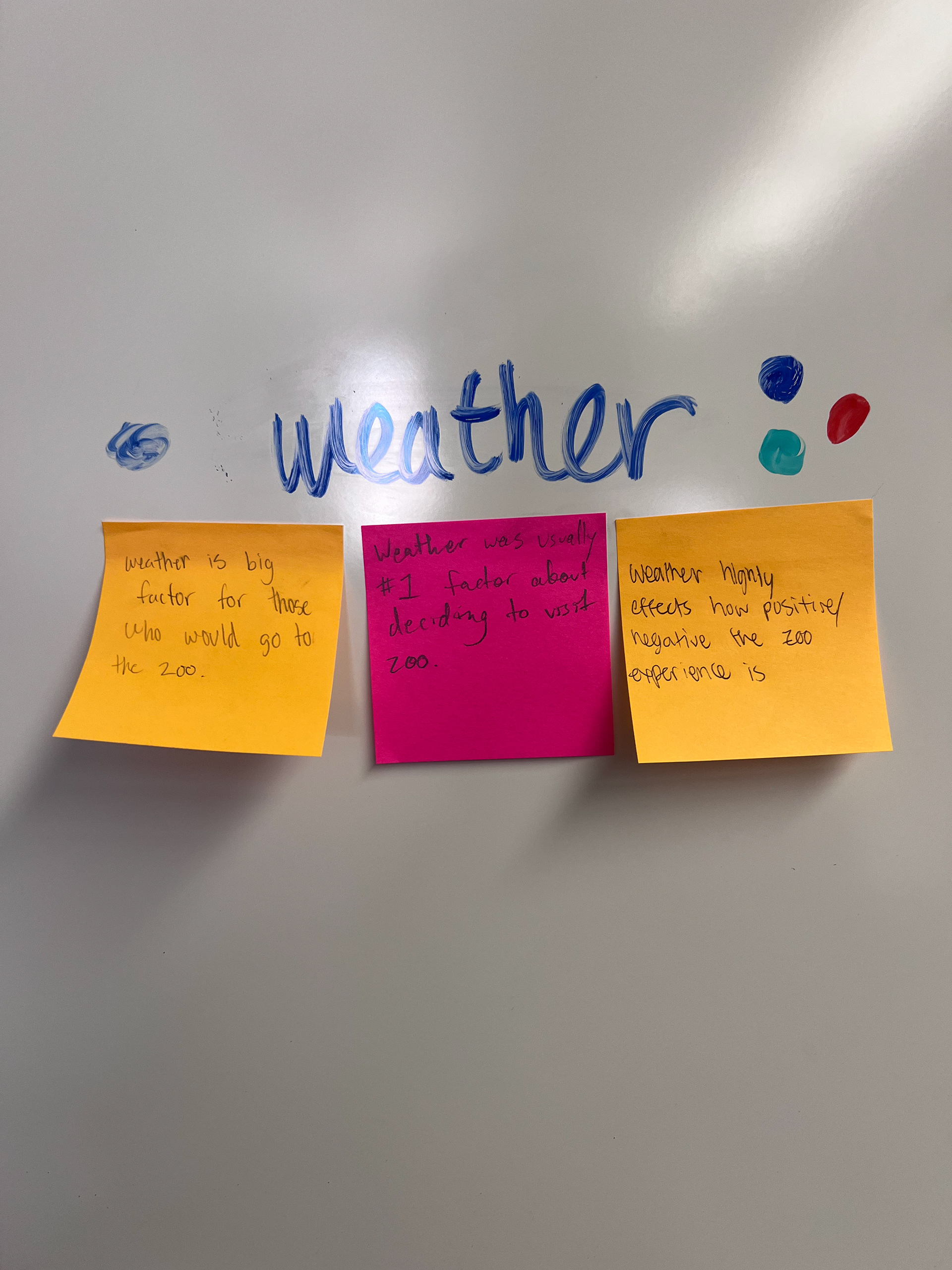
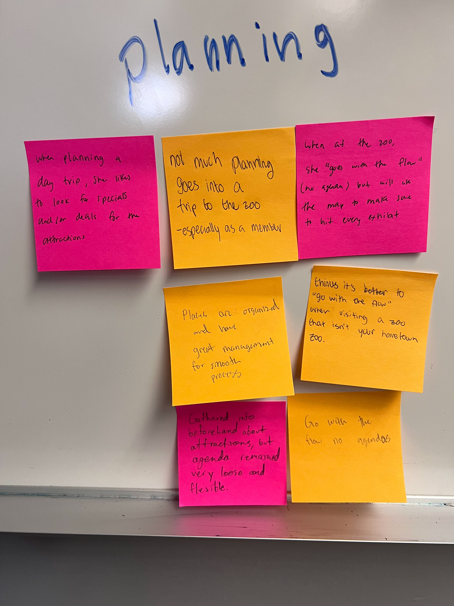
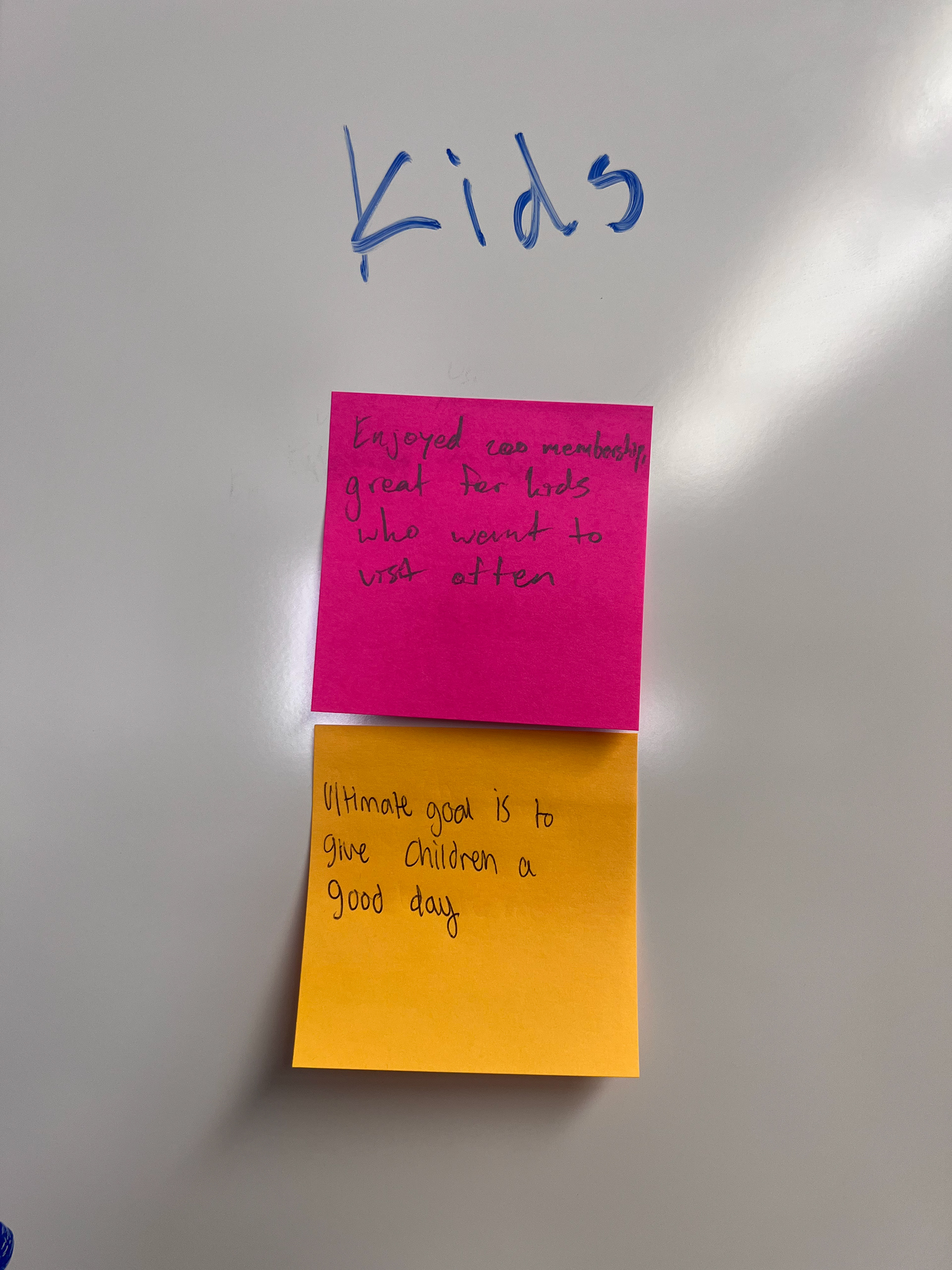
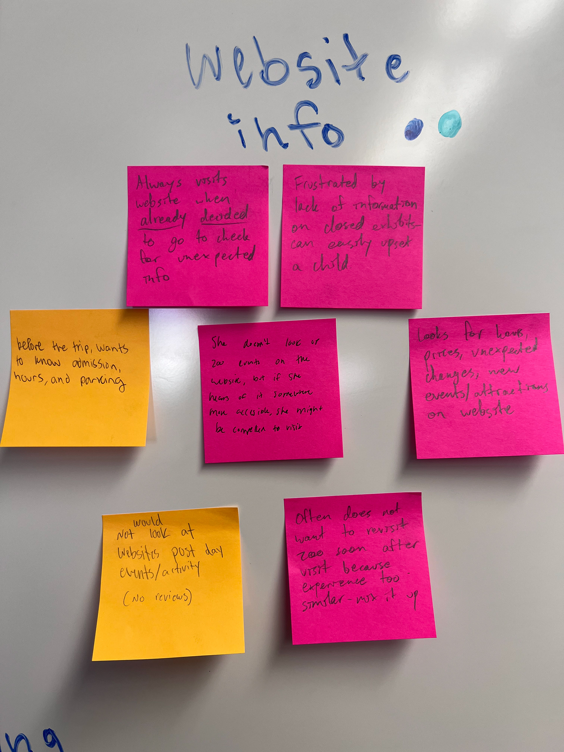
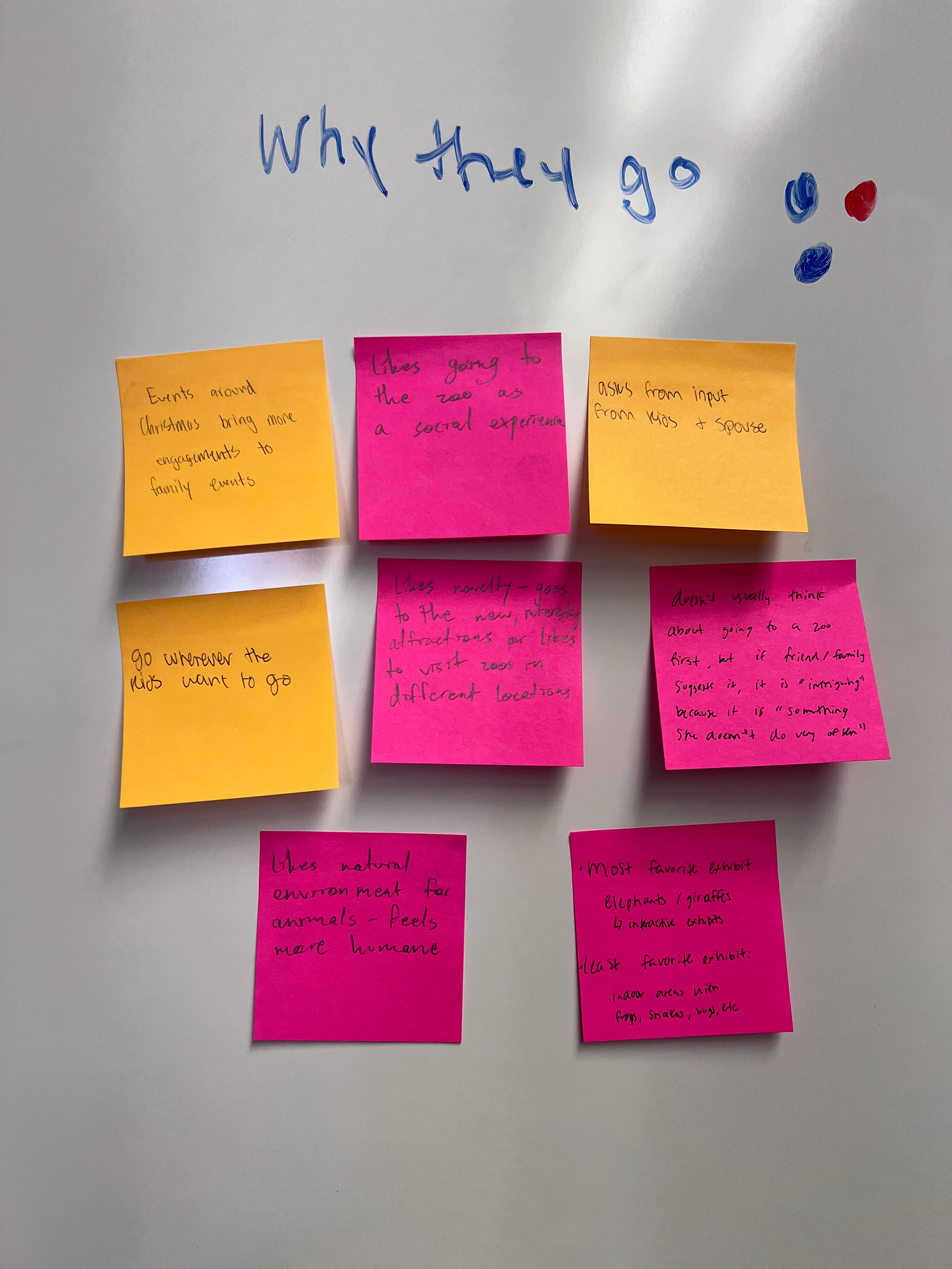
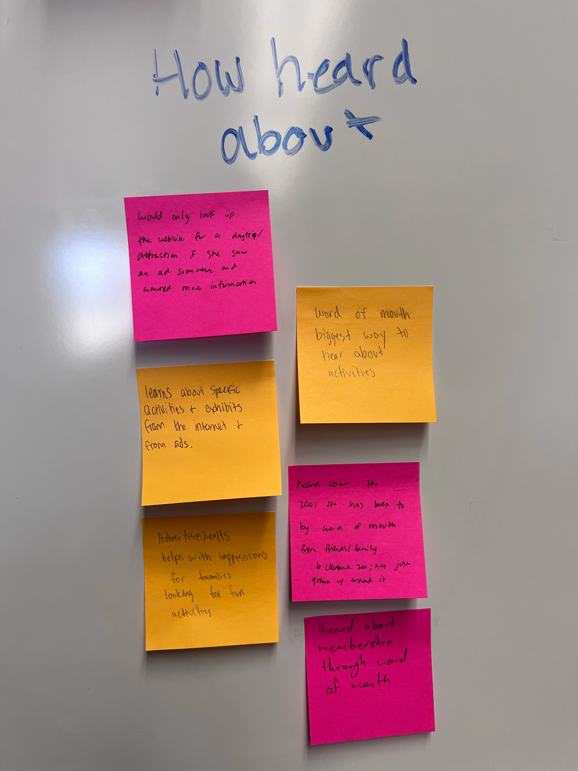
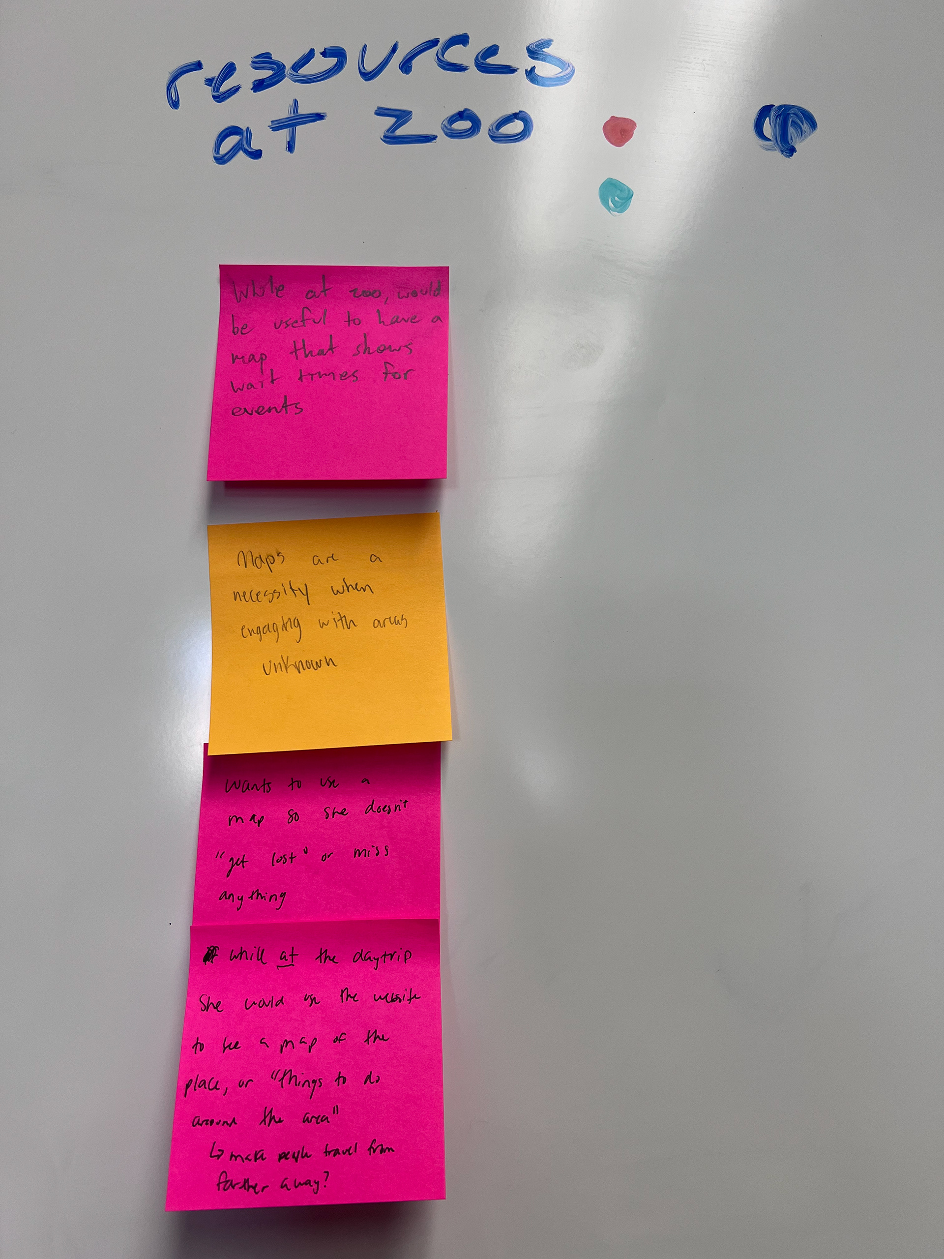
This system was very useful in efficiently organizing information without arguing over reasoning. By compiling all of the information on sticky notes and voting with dots, we were able to come to an agreement on sorting and processing information in a much easier manner.
The three categories which were voted as most important were "Resources at the Zoo," "Why They Go," and, although we did not expect it to be such a significant talking point, "Weather." We felt that "Resources at the Zoo" was important because the website needed to be useful both before a trip to the zoo and during it. We felt that "Why They Go" was important because understanding the context for which people would go the zoo and subsequently access the Zoo website was critical for tailoring the functionality of the website towards their needs. Finally, although we did not expect it to be so significant before our interviews, many of our interviewees noted that the weather could often make or break a trip to the zoo. Given that the Nashville Zoo website did not provide any easily identifiable information about weather, we determined that this was a functionality which needed adjustment.
Usability Testing
Next, our team set out to conduct usability testing on the Nashville Zoo website, with tasks testing for general functionality as well as several focusing on testable concepts derived from our interviews. We measured the difficulty of completing these tasks through measures such as wrong turns and additional information required to identify tasks that required the most immediate adjustment.
From this testing, we recommended that the Zoo website include a clearly labeled tab with information on currently open and closed exhibits, as the information was currently found within a link that was both misleadingly labeled and did not look clickable. We also recommended that the Zoo website include clearly identified information about the current weather and how the Nashville Zoo will respond, as the information was buried in the sites FAQ and was not easily found anywhere else. The Nashville Zoo does not close for bad weather, but including information about available ponchos or indoor exhibits may convince people to come to the zoo instead of canceling their trips when it rains. Finally, we recommended that the Zoo website rename the "Camps, Classes, and Overnights" tab as "Zoo Programs" and move it below the "School Group Trips" tab in the menu navigation, as several users thought that the "Camps, Classes, and Overnights" tab included resources for schools, despite the school group information being directly below it in the navigation.
Card Sort
After these recommendations, our team focused in further on the Nashville Zoo website's menu navigation. We had previously identified several issues with the site's menu navigation, and so to best understand how to reorganize the navigation we worked with a separate group who did not have experience with the Nashville Zoo website navigation. This group completed a card sort in which they organized menu labels based on logical groupings. We replaced some of these labels with descriptions, such as "ZooVentures," a program in which the zoo brings animals to your organization for educational purposes, to increase clarity.
The group that performed the card sort seemed to agree with our team that information regarding weather should be featured alongside other important informational sources such as hours, directions, and a map. Notably, they also rearranged the Visit and Experiences tabs into separate categories. One of these categories featured purchases regarding zoo visits, one of them featured things to do while at the zoo, and one of them featured information for group events. This was an effective way of clarifying the information which could previously be difficult to differentiate between the Visit and Experience tabs.
User Persona
After completing the card sort activity and evaluating the Nashville Zoo website navigation, the team shifted to construct a user persona. This was done to better understand why a user might be using the site, how they interact with it, and how the website fits into their needs within their overall life.
Notably, we decided to focus our user persona on a school teacher instead of a parent. While a parent may engage with some facets of the Zoo's website, such as general information gathering and ticket purchasing, that parent would be very unlikely to interact with the group event functions of the website. A teacher, on the other hand, would be more likely to interact with general information, ticket purchasing, and the group event sections of the website. This way, we could capture more website functionality through our persona. We also focused our persona on how busy the user was. As a school teacher and a parent, she grapples with many responsibilities. This allowed us to analyze the Nashville Zoo website with a specific focus on ease of use. How quickly and efficiently could a user interact with the site if they are trying to make the best use of their time? These focuses were very useful in helping us look at the specific contexts under which a user interacted with the Nashville Zoo website.
Website Design Persona
Finally, the team put together an overall website design persona to communicate our redesign for the overall branding and communication methods of the Nashville Zoo Website.
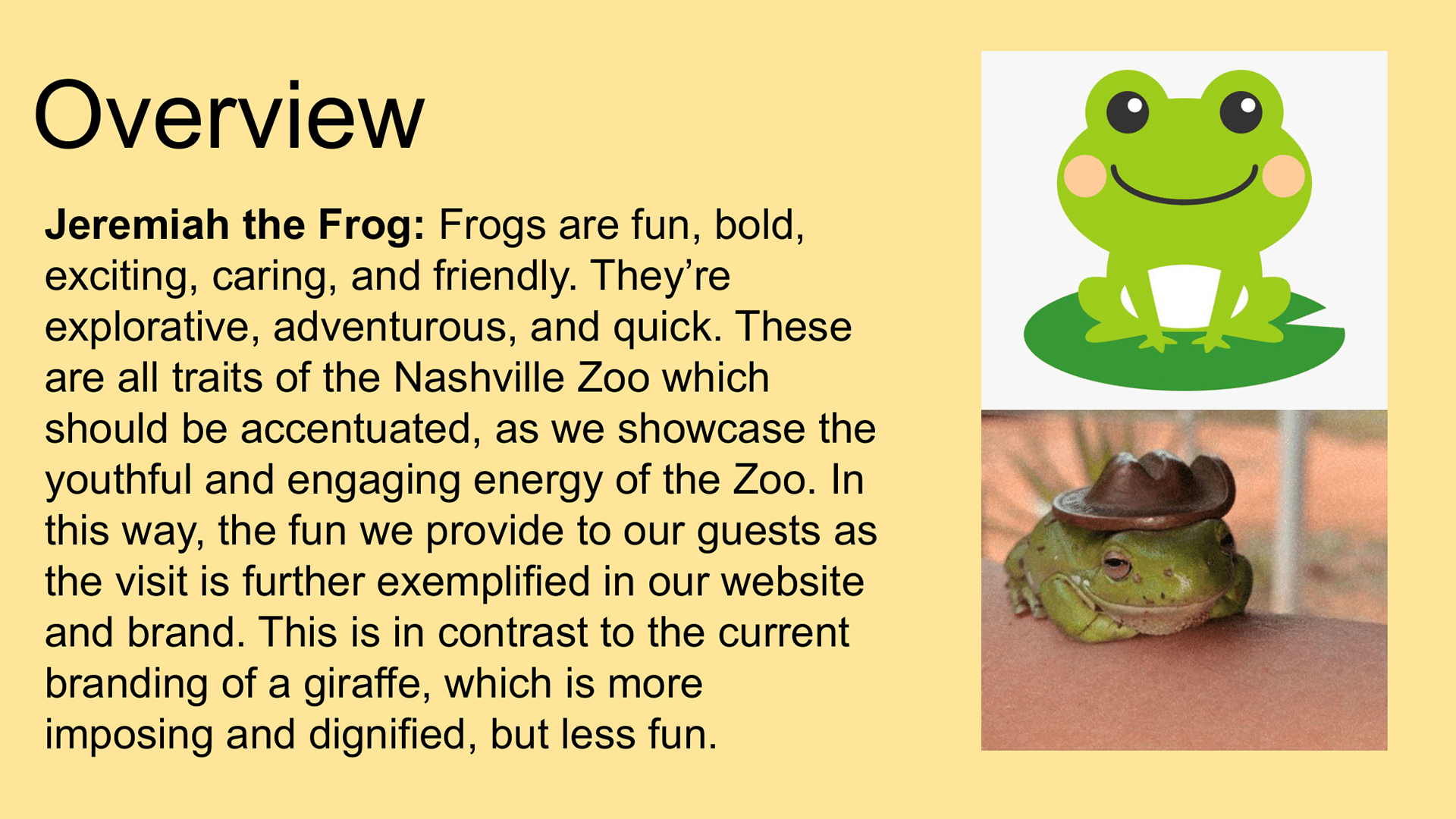
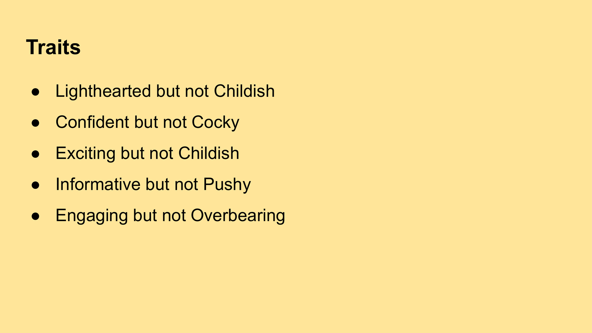
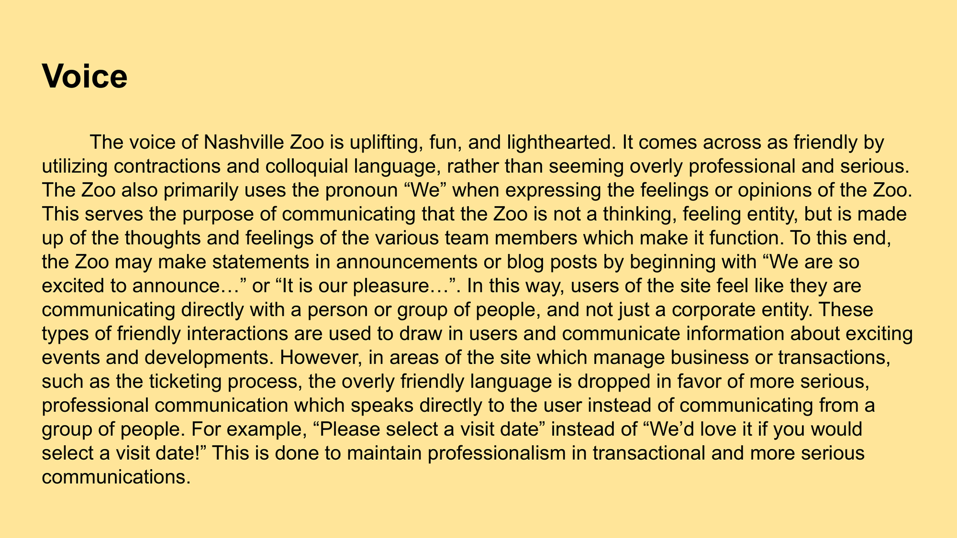
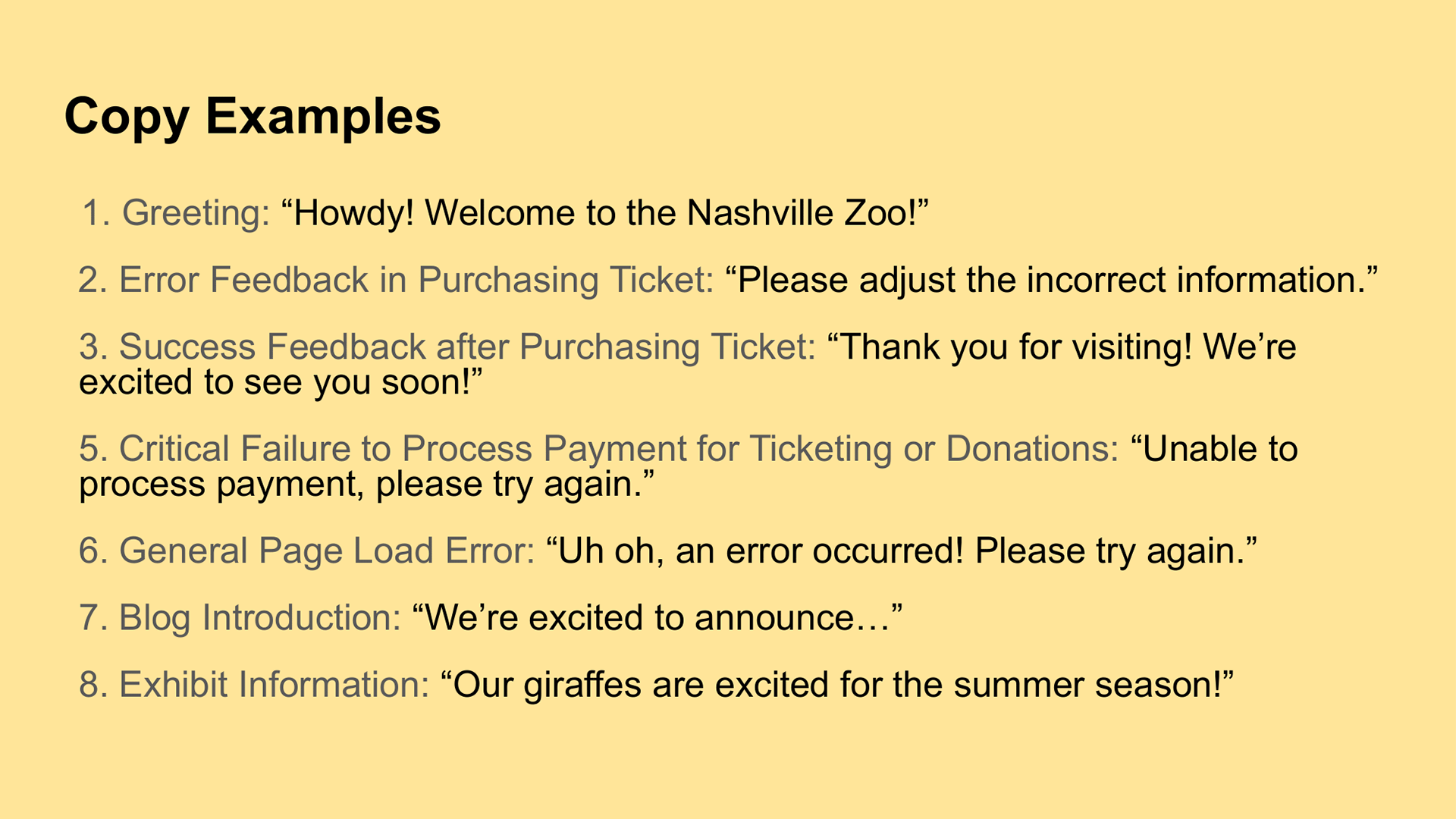
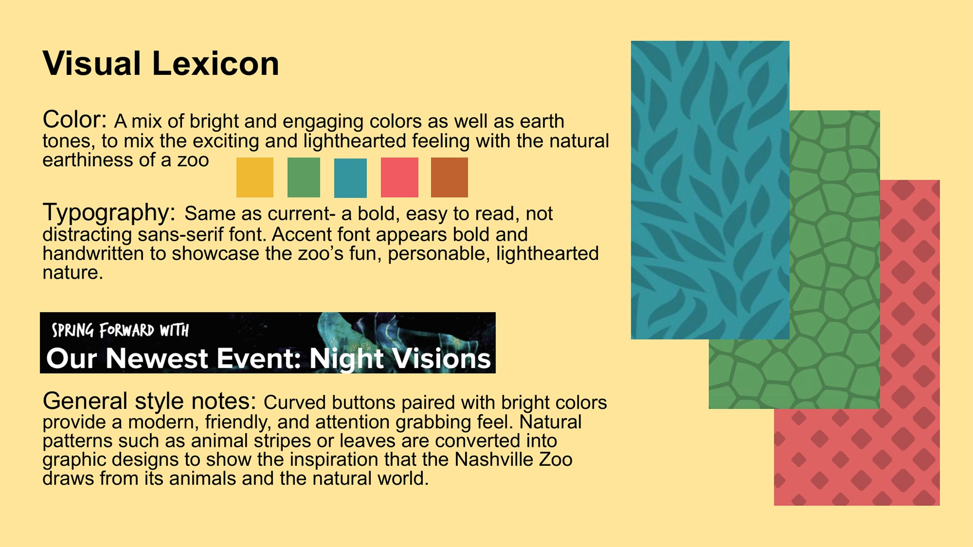
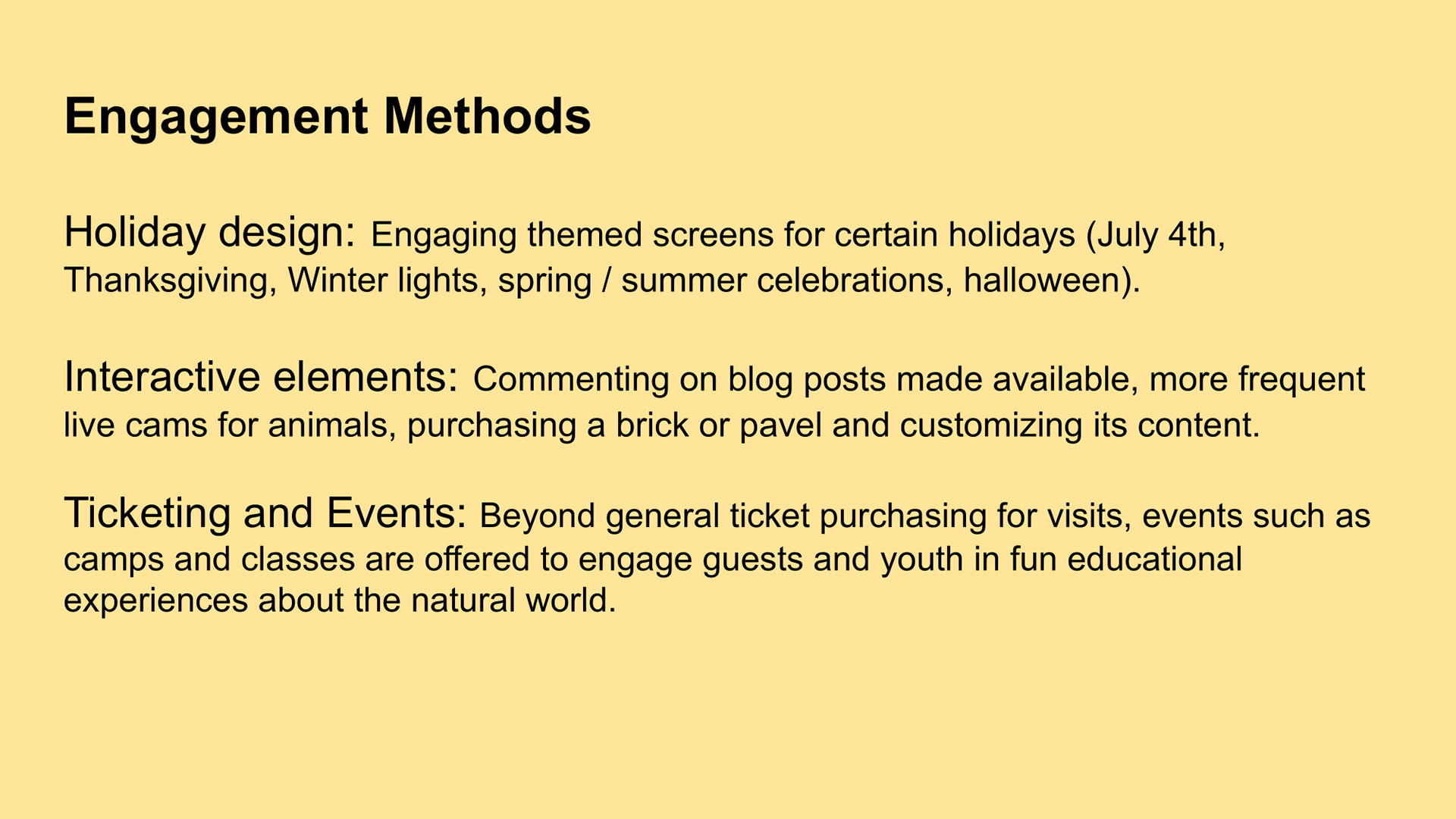
We developed the site design persona with a specific focus on the type of user who would be using the site. As our interviews showed, parents are likely to use the Nashville Zoo website as they plan trips. As our user persona shows, teachers may also use the Nashville Zoo website as they plan educational experiences for their students. In both of these examples, the user of the site is an adult, but the reason they are using the site is to plan a trip for one or more children. As a result, we created our design persona to be friendly and lighthearted, in a way that communicates that the Nashville Zoo is a welcoming and fun environment, perfectly suited for children. However, we ensured that the design persona did not come off as childish, still using serious language and communication methods where necessary, as the actual users of the sites will be adults who may expect some amount of professionalism.
Outcome
Through the various methods of user experience research and design, our team identified specific areas of improvement in the Nashville Zoo website's design, communication, and navigation. By clearly identifying and understanding who is using the website and what they are looking for in their experience, we recommended specific redesigns that allow the website to bend to the needs of the user, not the other way around. All of the research methods we utilized, while beneficial on their own, were made even more useful when used within the context of our other research methods, forming a comprehensive user profile which maximized the effectiveness of our insights and recommendations.
What I Learned
Through this project, I learned the importance of deliberate user experience testing. It is not enough just to see how a user completes a task (though that is a component of the research). One must also take into account context, reasoning, language, and many more factors which all combine to create the overall experience of interfacing with a website. Any one of these tests could be carried out alone, but each of them provides a meaningful addition to the understanding of a website and its interactions, and better guides the design process to give the user the best possible experience.